Tuesday, 23 March 2010

Font styles for poster


Looking into how important the title of the Poster is in attracting peoples attention i looked into website that would give me a wide range of options on font styles, this will give me a variety of options that i could choose from to title my poster.


The first option that i looked into was the type writer effect in which i found on one of my websites. I think that this font could be very effective if i put it on my poster as it looks very urban which would suit Paolo Nutinis image that he wants to portray amongst his audience. I want every aspect of my poster to suit my Artists style.


As my chosen song is about younger days and the lyrics relate a lot to childhood and the difference between childhood and adulthood, i think that ths writing font would be very appropriate in relation to the song lyrics. As this writing has a childs writing look about it therefore i thought that i could apply my knowledge of conventional promotion posters and album cover to my subsidary project.


Tuesday, 16 March 2010

First idea, breif poster

This is my first brief of my promoting poster, i chose to have a conventional image dominating the majority of the page to let the audience know who the artist is and also to portray the image. I wanted to have a large title over the top of the page to make it clear the name of the song, i decided to make the poster image link to the name of the song, so for that reason i chose to use the main image of the artist against the background of a busy or quiet street. Using the influence of James Morrison of his album cover 'Undiscovered' i decided that an option for the name style would be to have Paolo nutinis name is gold writing underneath the image of the street, the reason i chose gold writing was because i want it to look trophy-like.
I want to keep this poster simplistic but yet effective by including all of the important details such as, the artists style, the song name and the name of the artist, Paolo Nutini.

Subsidary products


Alongside our main project of making a music video, we have been asked to create two subsidary product, to compliment our project. I decided for my first sub that i would make a magazine advertisement to support the music video and advertise it. My second sub is going to be to produce an album cover.

Monday, 15 March 2010

Target Audience


The music by Paolo Nutini tends to be very feel good, in my point of view i would say that the target audience is for a more mature audience, yet not too sophisticated, the music that is written and performed by Paolo Nutini tends to have lyrics that creates a self reflective atmosphere so therefore i would aim his music at 16-30 years. Also the image that he portrays suggests his music is aimed at a more working class audience, the tattoos suggest adolesence and his image overall to me shows that he is aiming at a younger audience. He gains support from fans by being so multi cultural, by him wearing the 'Sweden' t-shirt, this shows a very partiotic side from the swedish. Paolo Nutini is originally from Glasgow so he will have a lot of support from his friends and family.

Thursday, 11 March 2010

Schedule List

As i am filming my video around winter time, this gives me a disadvantage. I aimed to film using only natural light however this is going to be difficult as when i leave college it is often getting dark so i am going to create a filming schedule;
I am aiming to use the camera during half terms, this means that i will have all day to capture the natural lighting. I booked a camera all throughout February half term. This meant that i was able to catch 7 days of different weather, as music video focuses a lot on the environment i wanted to pay close attention to contrasting weathers. From this i was able to capture a scene of a snowball fight. Something which i wanted to include.

Location


I needed to think carefully about where i was going to film my music video. As my chosen song is by Paolo Nutini his style of music has a very specific genre which i aimed at targetting a more mature audience. His music is generally produced to create a 'feel-good' atmosphere and my chosen song in particular created an image of freedom. I wanted to produce my video so it would be well suited to the genre of the song. The song 'These Streets' explains how life is good, using examples of an instance in which people are unhappy and talking about life as a young child where there are no problems. He uses portrays contrast between adults and children through the words of his song. These words influenced me to choose a child-like location.
Some examples of places of prime locations in which i chose to develop my music video would be;
Parks, football fields, snowball fights, empty streets, busy working hours, quiet roads, rivers, lakes and other places related to the countryside.

The images above portray the type of contrast that i wanted to portray in my music video. The freedom of the countryside relating to the freedom of childhood, and the busy working streets, realting to the stresses of adluthood, opposing to childhood.


I have created a list of my plan;


Wednesday, 3 February 2010

Plan of action

As one of my subsidiary products, i decided to make an album cover. To do this i needed to look into a variety of CD covers to get an influence on how i was going to design my album cover and what would be appropriate for my music genre. I wanted to look at album covers similar in some aspects but also different in music genre. I decided to look into a very influential artist, Van Morrison. As Van Morrison also has very laid back and relaxing music he also has a twist to his music by preaching as he is a very religious artist. Another artist i decided to look at is Paolo Nutini. In contrast to Van Morrison, Paolo Nutini's music is aimed at a younger audience, he has a more experimental side to his music and explores different varieties within his particular genre. My final album cover which i decided to look at was James Morrison's, the reason i decided to look at this was because his music is quite similar to my chosen artist Paolo Nutini, yet i feel his music is aimed at a more mature audience and most of his songs tend to be about love and relationships. I chose these three artists because they all base around the same sort of genre, yet they are all aimed a different aged audiences, so i wanted to look at how aiming an artist at a particular target audience can affect the way the album cover is designed.
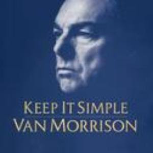


The Van Morrison album cover portrays an example of a more sophisticated music taste, but also quite sinister, the background is dark and the contrasting ghostly white face looks deathly and scary. This album cover is particularly interesting because the music by Van Morrison tends to be feel good. The colour of the background is very opposing to the lighting of the face, the image looks as if it is in negative because of the use of very contrasting colours. The face itself has a look about it which suggests a light is being shone on him. As Van Morrison is a christian and very religious, this could suggest the light of god being shone on him. He sings a lot about god in his lyrics.


This Album cover is very interesting, however it works very well in aspect of the music genre. The Album and the images have been edited to look like a cartoon or pop art. This cover is very colourful in relation to his 'feel good' music genre. This suggests that his music is aimed at a more creative audience and also signifies that he has a very artistic side to him, which is portrayed in his music. The use of different colours implies a variation suggesting that Paolo Nutini's music has a variety of different sides to it. He is posing in fours different stances, this accompanies the variety of colours and again supports the implication of variation.


This James Morrison album was released as a debut album in the United Kingdom, 31st July 2006. The cover has a very bland use of colours, in contrast to the Bold, Gold writing down the side of the album cover. The reason the producers have used this gold writing is to make it look trophy like. The image that James Morrison portrays is an urban, relaxed view. His music, similar to that of Paolo Nutini's is very feel good but also for a more sophisticated audience, this carries characteristics of Van Morrisons music.

Before i started to produce my music video there are a few stages that i want to complete to make the process more organised. First of all after making my video i need to move onto the other two tasks, which i have chosen to create an album cover and also make a poster to promote my music video. To do this i need to make a plan, first of all i am going to do some research into Album covers and get some examples to help me work out what is necessary to include on an album cover.
All of the above images are contrasting.